Designers' Guide
Learn how to start designing using the Nulogy Design System (NDS).
Tools and assets
- Figma as our design tool for creating high-fidelity mockups, prototyping, version control, and team collaboration.
- IBM Plex as a Nulogy's sole typeface
- NDS UI kit as a library of Figma styles and components
- This website as a component reference guide
Understanding NDS visual language
To be effective at using the Nulogy Design System designers should familiarize themselves with the basics of NDS visual language. The following articles provide a good starting point:
Designing with NDS in Figma
NDS components
In Figma, the NDS components are available under the Assets panel in Left Sidebar. The components are easily drag-and-dropped into the working frame and further customized through Layer and Design panels.
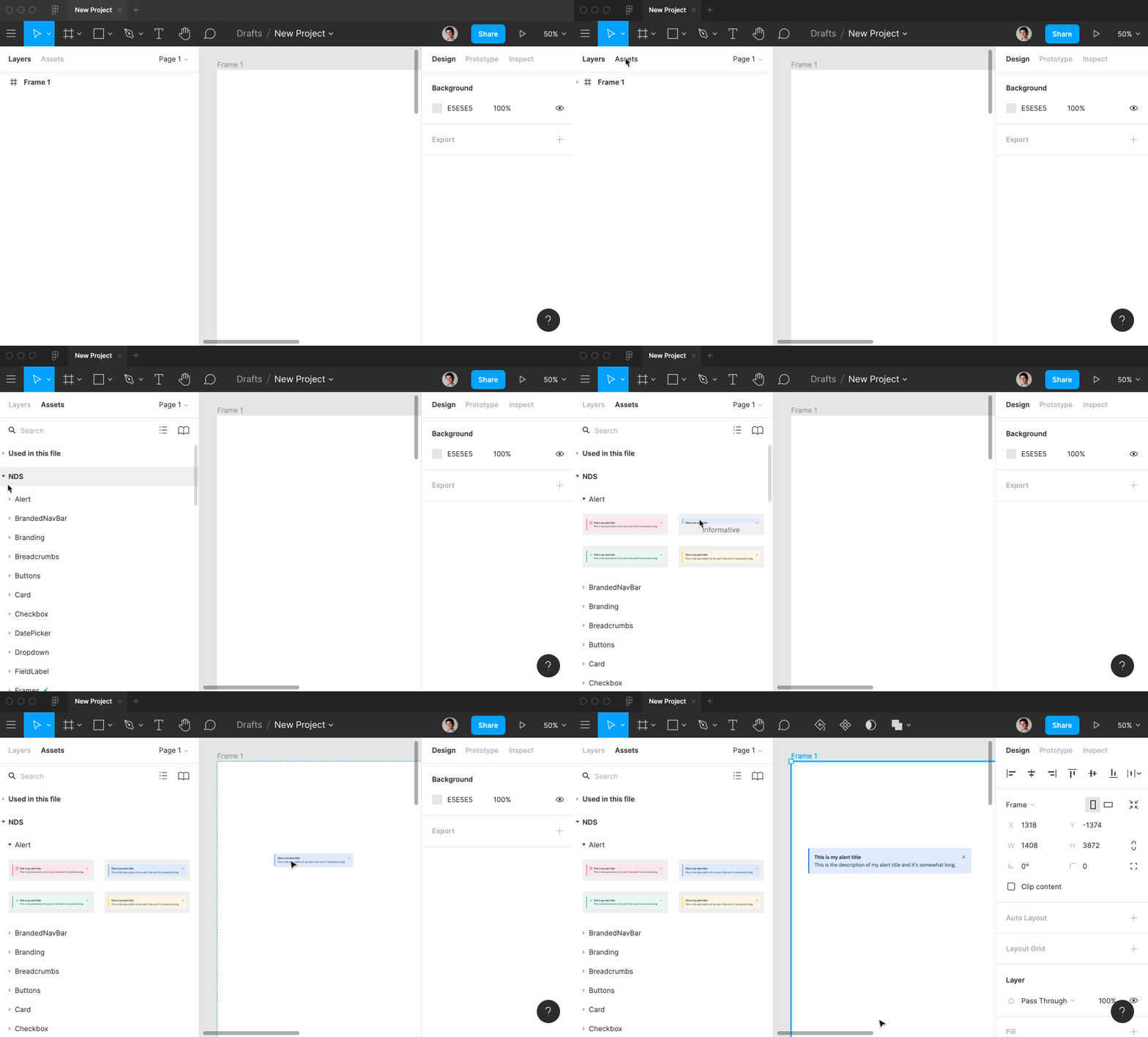
Using NDS components in Figma
NDS styles
By using available text, colours, shadows, and grid styles in the Layer panel, designers ensure that their designs stay in line with NDS' visual style.
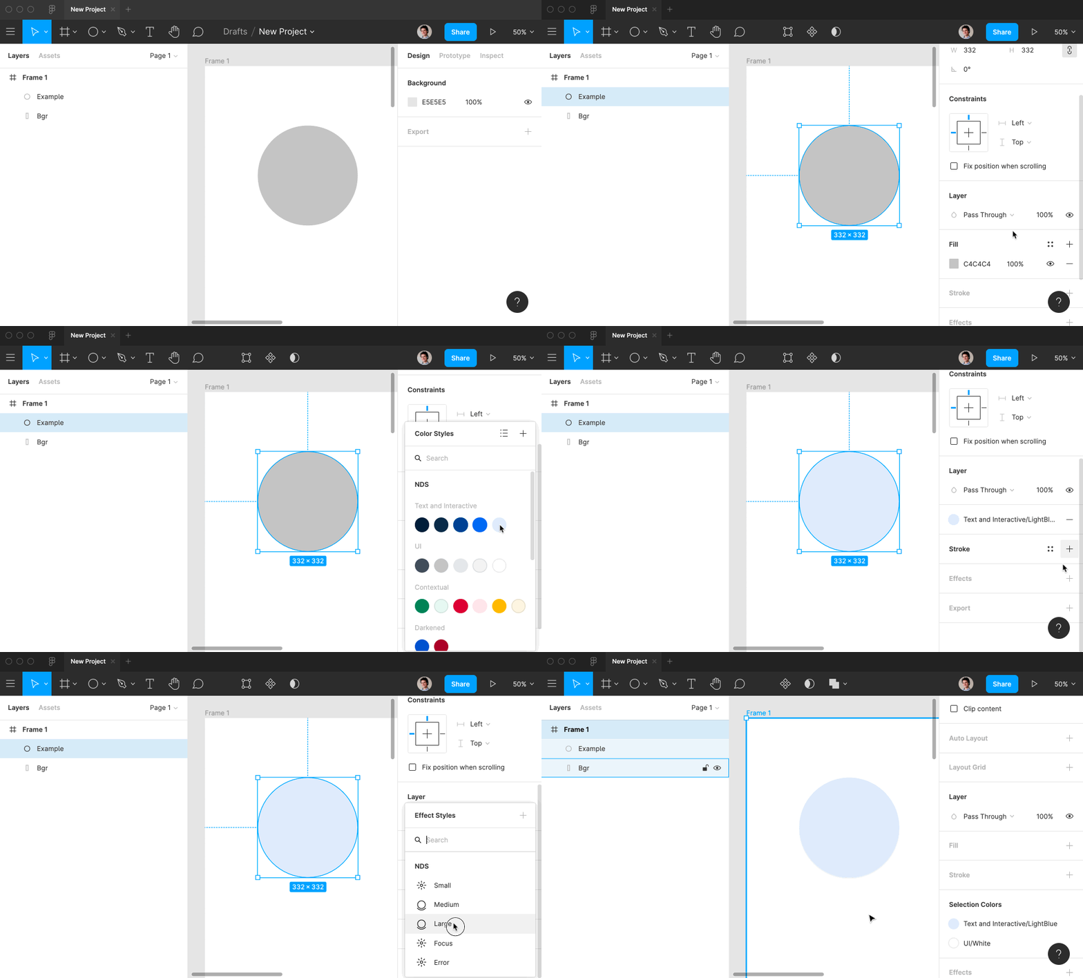
Using NDS colour, and shadow styles in Figma
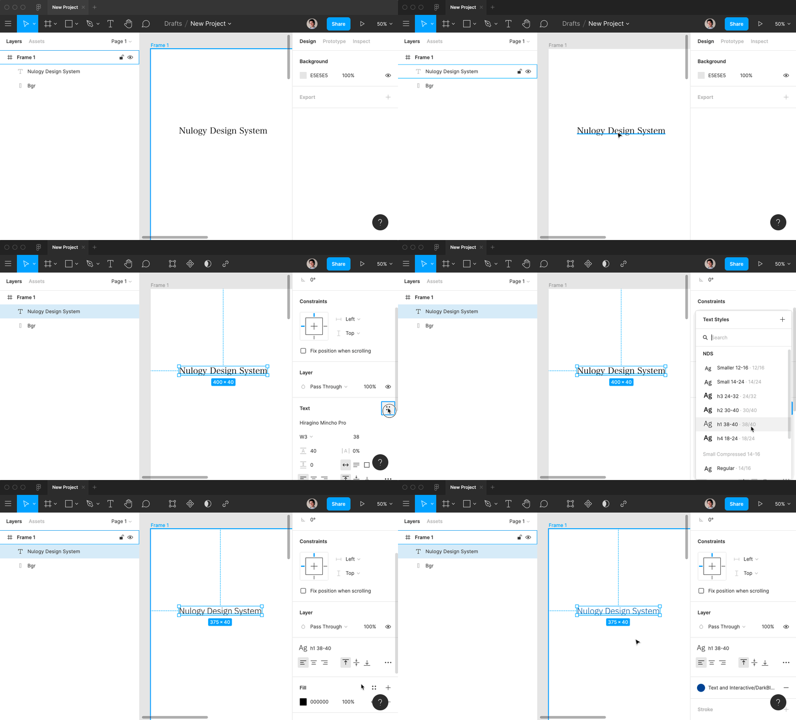
Using NDS text styles in Figma

Using NDS grid styles and adjusting nudge amount in Figma
Default sreen sizes and Frame component
The NDS Frame component is created to help designers set the working canvas. It comes in different sizes that match breakpoints in NDS. Once imported the Frame component should be detached (Detach Instance) so that other elements can be nested inside.
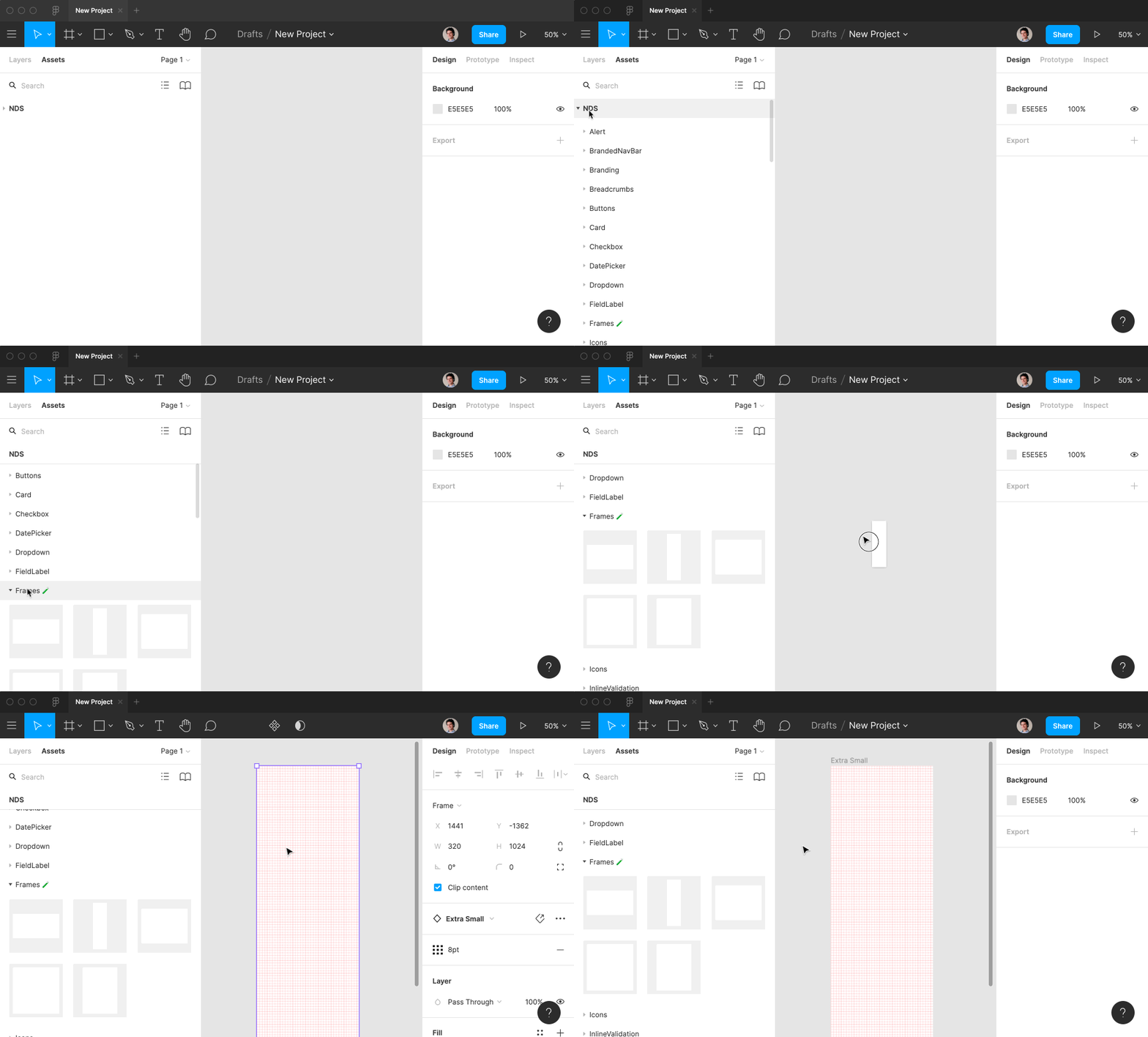
Using NDS Frame component and setting the working canvas
Using version history
To leave a record of changes made throughout the design process and to be able to revert to desired revision designs should be regularelly saved to version history. Version history is available in
File menu under Show Version History
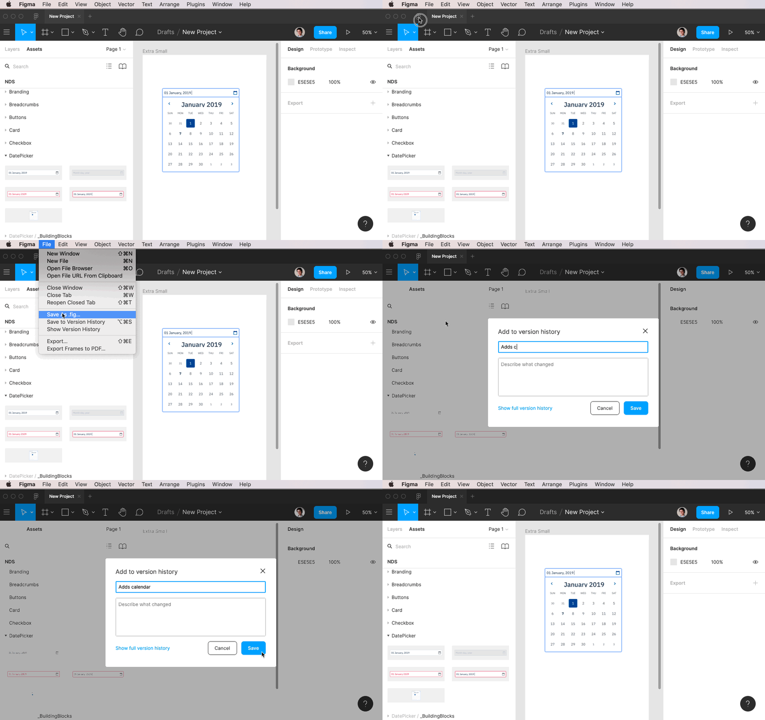
Saving version history
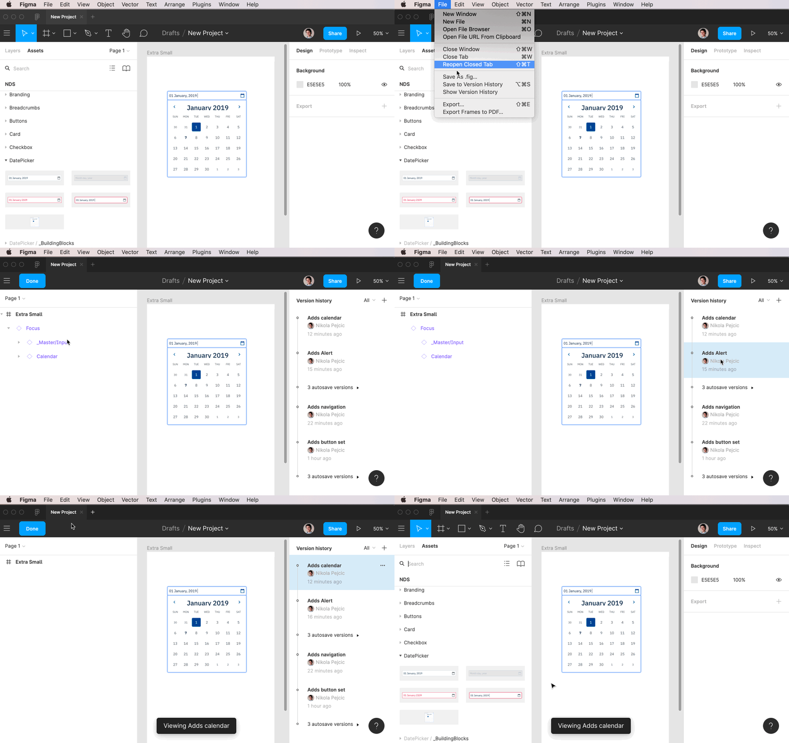
Viewing version history